60 tips for a successful entry to Australasia's Top Emerging Photographers 2024
For a decade and a half, Capture magazine has been on a mission to help discover Australasia’s very best emerging talent. During this time, the competition has uncovered and helped boost the careers of countless emerging photographers from Australia and New Zealand. The call for entries in the 16th year of Australasia's Top Emerging Photographers 2024 is open. Enter now! The compeition closes 17 March 2024. Below is a collection of the very best advice provided by the judges from previous compeitions.

CLICK HERE TO ENTER
The judges
Helping decide the winners, place-getters, and Top 10 and Top 20 entries across the nine categories is no easy feat. As such, we rely on the wisdom, experience, and expertise of some of the world’s very finest photographers and industry experts. With such impressive credentials, our judges are suitably qualified for the important role they take on. But don’t take my word, scroll down and have a look at who was on board to help judge the 2022 competition. This year, we're thrilled to have 48 luminaries from the around the world on the judging panel. Follow this link to see the full list.
Feedback matters
Each year, we ask the judges to provide feedback and constructive criticism on the categories they judged so that we can share this invaluable information with you. It’s not designed to provide a warm and fuzzy feeling, but instead be helpful to those about to enter the competition.
While the tips are broken down by category, the advice is likely to be applicable across multiple genres of photography.

Winning advice
ANIMAL
1. It’s challenging to present a narrative in three photographs, but the winners did just that.

2. A number of submissions felt more like series or sequences, rather than a portfolio. This narrowed their opportunity to stand out in an exceptional field.
3. Shades of difference separated the winners. Often it came down to what the photographer brought to the situation, the level of difficulty, consistency in the approach, and editing of the work.
4. When curating a portfolio, you want to choose images that work cohesively together to either tell a story or that visually complement each other. I saw a lot of excellent single shots in this category, however there were many instances where the other images chosen were either lacking in technical ability or did not support the narrative.

5. It pays to run through a mental checklist when editing images for competitions. Aim to remove all visible dust spots, ensure the focus sharp (especially the eyes), aim for natural editing, avoid heavy handed darkening of backgrounds, and check that you haven’t over sharpened.
ARCHITECTURE
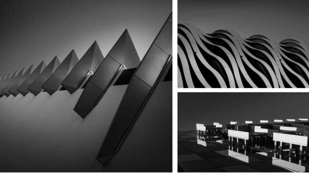
6. We are not here to judge architecture; we are more interested in the skills and innovative vision that a photographer can bring to the assignment. Anyone can photograph an artwork, but we want to celebrate those photographers that can turn anything into an artwork.
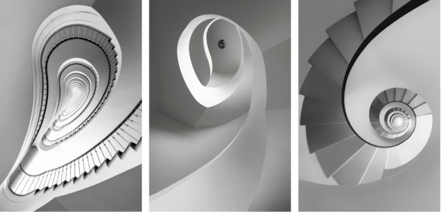
7. Successful entries demonstrated a consistency of approach and execution across the portfolio, irrespective of the specific location.

8. A good architectural photograph has to show the building form in a strong and memorable composition. Too many photographers are taking artful details which describe their skill, not the architect.
ART
9. One thing I noticed was that some entrants attempted to replicate images that have been successful in previous years. This is a category that allows for experimentation, so experiment! Try new ideas or put your own spin on old techniques. Judges will always take note of something different and new, even if it isn’t technically perfect, over a perfectly executed image that has been seen many times before.
10. The most compelling images were those demonstrating innovation and originality, and the ability to execute a concept.
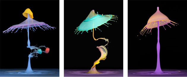
11. Art is intensely personal and highly subjective, but the ultimate goal is whether the viewer wants to keep coming back to look at it and whether it stays in their mind.
12. To me, art is not about a technique, it’s about creating work that tells a story or at the very least evokes an emotion. It should challenge the viewer, not just try to play the role of decoration. I think a lot of the entrants have mixed up using an alternative process as meaning art.

13. The art category is a chance to show who you are as a photographer, not what techniques you can apply to imagery.
14. A camera is just a tool. Just let your imagination and creativity take over; it’s all about taking risks.
15. Art should invite the viewer to think deeper into the image and unravel stories, intended stories as well created ones.

16. The stronger images in this category were as diverse as the journey from imagination to raw reality, exploring both hidden worlds and those lost in plain sight. It is important that technique is not distracting, but complements the final presentation.
17. Each portfolio chosen demonstrated a high level of cohesiveness and a considered concept across each of the three images.
BLACK & WHITE
18. Many entries were just three almost identical versions of the same photo. If you’re given three entries in a competition, take advantage of that opportunity.

19. Black and white photography isn’t just desaturated colour; it’s tone, form, shape, texture, and subject all combined so that colour just isn’t necessary. Watch your histograms and don’t clip your blacks and whites.
20. Black and white calls for supreme understanding of tones: just because a camera can capture a seemingly infinite amount of tonal information doesn’t mean we can’t show restraint in our images.
21. If you can see in tones then you’ve won half the battle. Don’t just desaturate an image; go out and shoot with the intention to capture the contrast, tone, and texture as part of the composition. Once this is mastered you can worry about the subject.

DOCUMENTARY
22. Work to have a strong thread that holds the series of images together: this could be a place, person, issue, or concept. Returning to the project multiple times over a period of time and narrowing the work along the way is the foundation of doing documentary work. For the final series, avoid redundancy. Each image should further the story, not repeat something you have already communicated in other photographs.
23. The most successful stories displayed not only terrific photography, but taught the viewer something about the subject’s experience. There were stories of both joy and despair, told equally well and from each photographer’s particular visual perspective. For me, seeing how photographers see is one of the great pleasures as a judge.

24. A successful documentary essay draws the viewer into the lives or subject matter that you’re trying to convey. Choosing a story that you believe in is a great starting point. Consider linking images in a consistent style or approach, building the narrative over time. It’s more than a series of similar images created at one event. Considered work that shows a real sense of intimacy and connection to the story and people the photographer is working with is what I’m drawn to most.
25. I found the successful folios gave me a glimpse into the relationship the photographer had with their subject matter, allowing the viewer a true connection into what the photographer was feeling and wanting to communicate. A good documentary photographer has a story to convey and a critical eye for the subject. In some of the folios the ‘rawness’ of the imagery reinforced the subject matter to stylistically create an intimate ‘fly on the wall’ approach allowing relatability for the viewer to the photographer’s story.

26. A series of documentary images should give the viewer a glimpse into a special story, an insight into a larger picture, leaving you wanting to see more.
27. The top entries were evocative, considered, had a beginning, middle, and end, and the words that went beside them supported the work.
28. In some entries, individual images were beautifully composed, but did not gel for me as a series.
29. When it comes to documentary photography, the skill is your ability to present a pictorial narrative; the photographs should speak for themselves – the accompanying words should only elaborate...

LANDSCAPE
30. Regardless of where you go to make images, the most important tool you can ever take with you is your own personal vision and understanding of the world. Don’t just be a facsimile machine, capturing whatever is in front of you; learn to see, process and empathise with the environment around you, and then convert those feelings into a sophisticated and emotional response.
31. While there were many highly commended images demonstrating sound camera craft and very strong compositions, it was images that presented something ‘different’ and ‘new’ to the judge that were awarded. It was these images that stood out and captivated the judges’ attention.

32. The landscapes I found most engaging were of a lyrical and poetic nature. They were evocative, mysterious, and atmospheric without being cliched. There seemed a deeper, personal connection to the landscapes they were depicting. Finding the essence of a landscape involves spending time observing it, developing a relation to it, and then capturing its distinct elements.
33. What would often cancel a portfolio for me was there would be multiple formats and horizon lines all over the place that just didn’t work. Some images were overcooked in Photoshop, but I tried not to allow bad Photoshop skills to influence my estimation of the potential of the images.

34. A number of the images felt technique driven, and a lot of the techniques used were employing the old tropes. It felt to me the photographers were relying on a style. Numerous images felt like the photographers were making post cards, rather than looking for a connection to the landscape.
35. Technique alone will only take you so far. Combine it with mood, style, impact, and some narrative, or even simple aesthetic, and you have the recipe for strong and memorable imagery.
36. Interestingly, given our recent history of extreme weather events, there were very few images that reflected on climate change. Most were spectacular affirmations of nature’s beauty, rather than the disturbing realities unfolding in our landscapes. This might be worthy of consideration for future entries.
37. Some portfolios were let down by weak images in the set. Some individual images were so good that on their own they could have been winners. When viewing each portfolio, there had to be connection in the set.
38. The stand-out images weren’t only technically impeccable, they were emotionally evocative as well.
39. The qualities that rose to top of the landscape portfolios involved intentional narrative, unmistakeable visual impact, a sense of innovation in either the choice of subject matter or the presentation, joining thread or cohesive aspect of style, and, of course, consistent image calibre across all three images
40. While many of the entries were extremely competent and technically adventurous, they relied too much on the wow factor of tricky effects, over-saturated colours with landscapes that appeared all too perfect – like a series of screensavers. Some environments were visually complex with extraordinary colour palettes, but there was too much emphasis given to colour or abstract patterns which became the overall subject of the work.

PORTRAIT
41. A great portrait should connect the viewer and the subject. As a viewer I should feel something about the person; I should feel as if there is some kind of narrative to the picture.
42. I love to see portraits that I can’t look away from. When an image can capture my attention and leave me with more questions than before I saw it, the photographer has done their job.
43. The challenge is to make three portraits of three different people or ideas, and do it in a way that reveals your style and vision in all three.

44. Portraiture isn't about taking a likeness of someone, but creating an image that conveys the subject’s essence, or part of it. This can be achieved by understanding who you are photographing, communication with your sitter while shooting, and even the environment the sitter is in.
45. I still love to be challenged as to what a portrait actually is. A great portrait doesn't necessarily need to be composed well, be technically sound, or even show your subject in the frame, it just needs to convey their soul.
46. The portfolios that stood out the most were from the photographers that connected with their subjects. A successful portrait image allows the audience to feel and think about that photograph and want to learn more.

47. I was drawn to the classic and to the unique, and most of all to the images where the subjects communicated with me.
48. It would have been nice to see people push traditional boundaries a bit more. A good portrait should tell an intriguing story about the subject.
49. There were submissions with definite winning individual portraits in them, but they didn’t rank because there were others in the series that clearly didn’t belong. Remember to be ruthless in your selection. One image might mean a lot to you, but if it doesn’t work with the others, it has to go.
50. A portrait can take many forms, there is however an x-factor quality in all truly great portraits. A sense that a revealing moment has transpired, been captured, and shared for all to see. Sometimes, it’s those in-between moments when photographing that can produce the most striking portraits.
51. A good portrait provides an answer. A brilliant portrait raises questions and makes us think.
52. Portraiture is a collaboration between two people – the photographer and the sitter. It is important to remember that for a successful portrait the subject’s real nature must be present, and this occurs when there is communication happening between the two.
53. Cohesiveness should be considered across all of the images within the portfolio. Each photo should be as strong as the next in the set, but still remain consistent.

SINGLE SHOT
54. I’m always looking for a strong ‘wow’ moment that makes me look twice. A single image needs to tell the whole story. I’m looking for something different with impact and strong composition.
55. The best photographers were able to capture a moment (of action or stillness) and transport the viewer into that moment.

56. Impact, emotional engagement, innovation, a clearly decisive moment, multiple layers of interpretation, and originality of perspective and presentation are some of the factors that allow an image to rise through the wider set beyond the solid necessities of technical prowess, design, and well considered composition that any highly awarded image needs to begin with.
57. For this category, immediate impact is key, coupled with originality and a display of technical understanding.
58. Images that make you stop, look, and wonder, while all executed with a high standard of editing and craft were the ones that caught my attention.
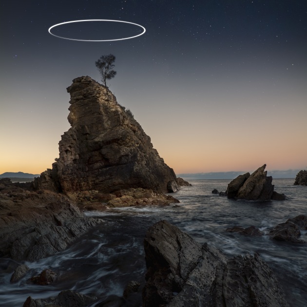
59. The best images offered the audience clever and well considered ideas delivered with flawless execution. Sadly, many other great images in this category didn’t make the cut simply because they were let down by average technique and execution. To be a great photographer, you really need to be good at everything, from concept to post.
60. Images that rise to the top tend to have strong graphic content and flawless technical execution. Photographs that show me something I haven’t seen before in quite the same way make an impression.
CLICK HERE TO ENTER
ENTER AUSTRALASIA'S TOP EMERGING PHOTOGRAPHERS

Get more stories like this delivered
free to your inbox. Sign up here.

